Configuring the 3D Viewer Field
Once you have created the 3D Viewer Field, you need to configure it to suit your specific requirements. The following configuration options allow you to customize how the field functions and displays in both item and category views.
Access Field Configuration
- Navigate to Content -> Fields in the Joomla admin panel.
- Click on the field's name to access its configuration.
Input Options
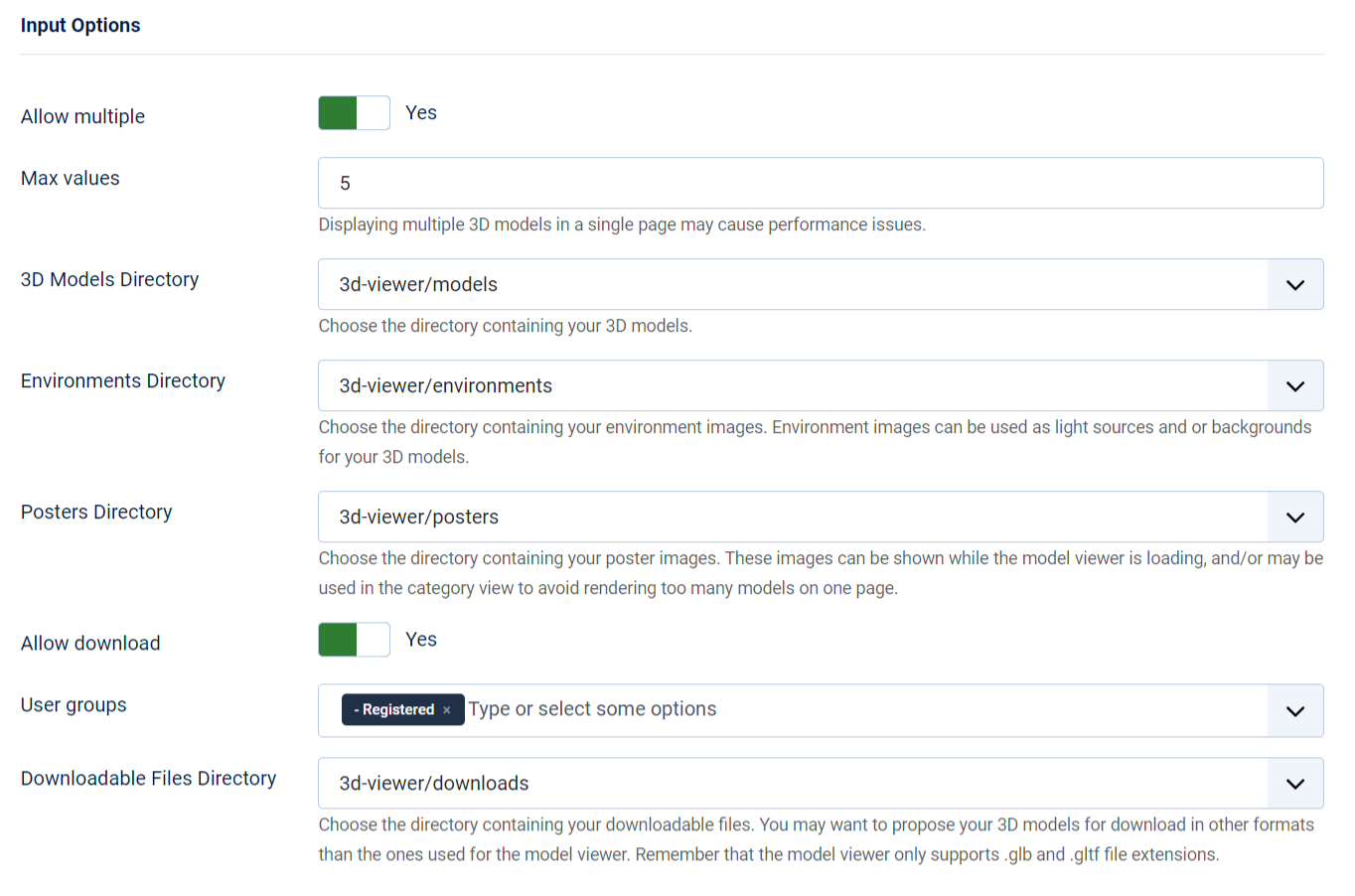
These options define how the field accepts input from users and what directories it uses for various assets:
- Allow Multiple (Yes/No): Allows multiple 3D models to be uploaded to a single field.
- Max Values: Specify the maximum number of 3D models that can be uploaded if "Allow Multiple" is set to yes.
- 3D Models Directory: Set the directory in Joomla’s media manager where 3D model files (e.g., glb, gltf) are stored.
- Environments Directory: Specify the directory where environment images (e.g., hdr) for the model view editor are stored.
- Posters Directory: Set the directory for storing poster images. A poster is an image displayed while the 3D model is loading or in category view to avoid rendering too many 3D models at once.
- Allow Download (Yes/No): Enables the option for users to download the attached 3D model files.
- User Groups (Allowed to Download): Specify which user groups are allowed to download the attached files if "Allow Download" is set to yes.
- Downloadable Files Directory: Set the directory in Joomla’s media manager where downloadable files are stored if " Allow Download" is enabled.
Allowing too many values may impact site performance.
Item View Display Options
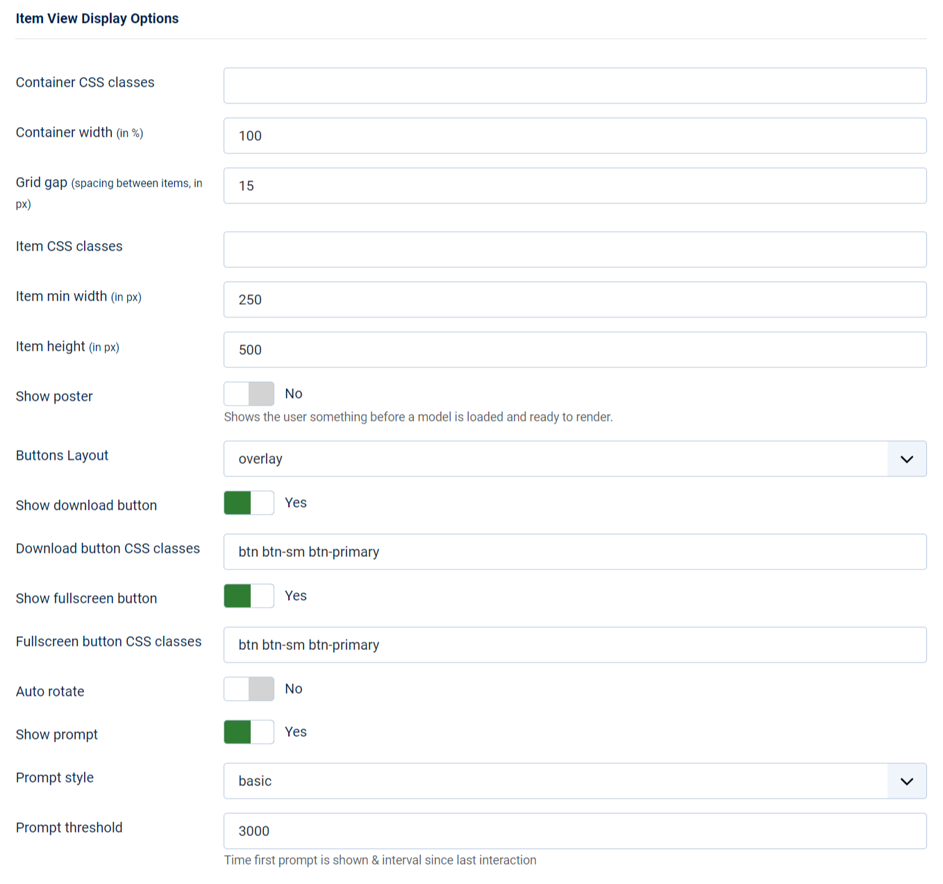
Determine how the field will be presented on your site in the Item view.
- Container CSS Classes: Specify classes for the container element surrounding your 3D Models. You can assign
multiple classes by separating them with spaces, e.g.,
container-fluid my-container. - Container Width (in %): Define the percentage-based size of the container element that holds the 3D models for display.
- Grid gap (in px): Determine the spacing between each individual 3D model display within the container.
- Item CSS Classes: Set classes for each individual 3D model display rendered by the 3D Viewer field. You can apply
multiple classes, e.g.,
shadow-sm rounded border-0. - Item Min Width (in px): Set the minimum size in pixels for each individual 3D model display within the container, especially useful for responsive designs.
- Item Height (in px): Specify the height of each individual 3D model display within the container.
- Show Poster (Yes/No): Shows the user something before a model is loaded and ready to render.
- Buttons Layout: Choose a layout type to display your fullscreen and download buttons.
- overlay: Shows the buttons on top of the 3D model.
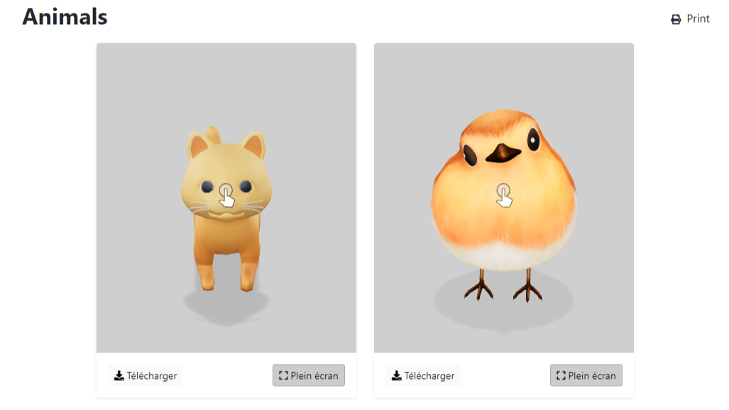
- card footer: Displays the buttons underneath the 3D model, giving it a card-like appearance.
- Show Download Button(Yes/No): Decide whether to display the download button or not.
- Download Button CSS Classes: Define a list of classes for the download button, e.g.,
btn btn-sm btn-light. - Download Button Text: Customize the text displayed on the download button (default is empty). Only if Buttons Layout is card footer.
- Show Fullscreen Button(Yes/No): Specify whether to display the fullscreen button. The fullscreen button enables users to view the 3D model in fullscreen.
- Fullscreen Button CSS Classes: Define a list of classes for the fullscreen button,
e.g.,
btn btn-sm btn-light. - Fullscreen Button Text: Set the text to display in the fullscreen button (default is empty). Only if Buttons Layout is card footer.
- Auto Rotate(Yes/No): Decide whether the 3D model should rotate automatically when rendered.
- Auto Rotate Start Delay: The delay before the auto rotation starts.
- Show Prompt(Yes/No): Choose whether to display the interaction prompt, which informs users that they can interact with the 3D model being shown. This setting applies to all models within the container.
- Prompt Style:
- basic: A static interaction prompt.
- wiggle: An animated interaction prompt.
- Prompt Threshold: Specify the delay before the interaction prompt is shown, relative to the user's last interaction with the 3D model.
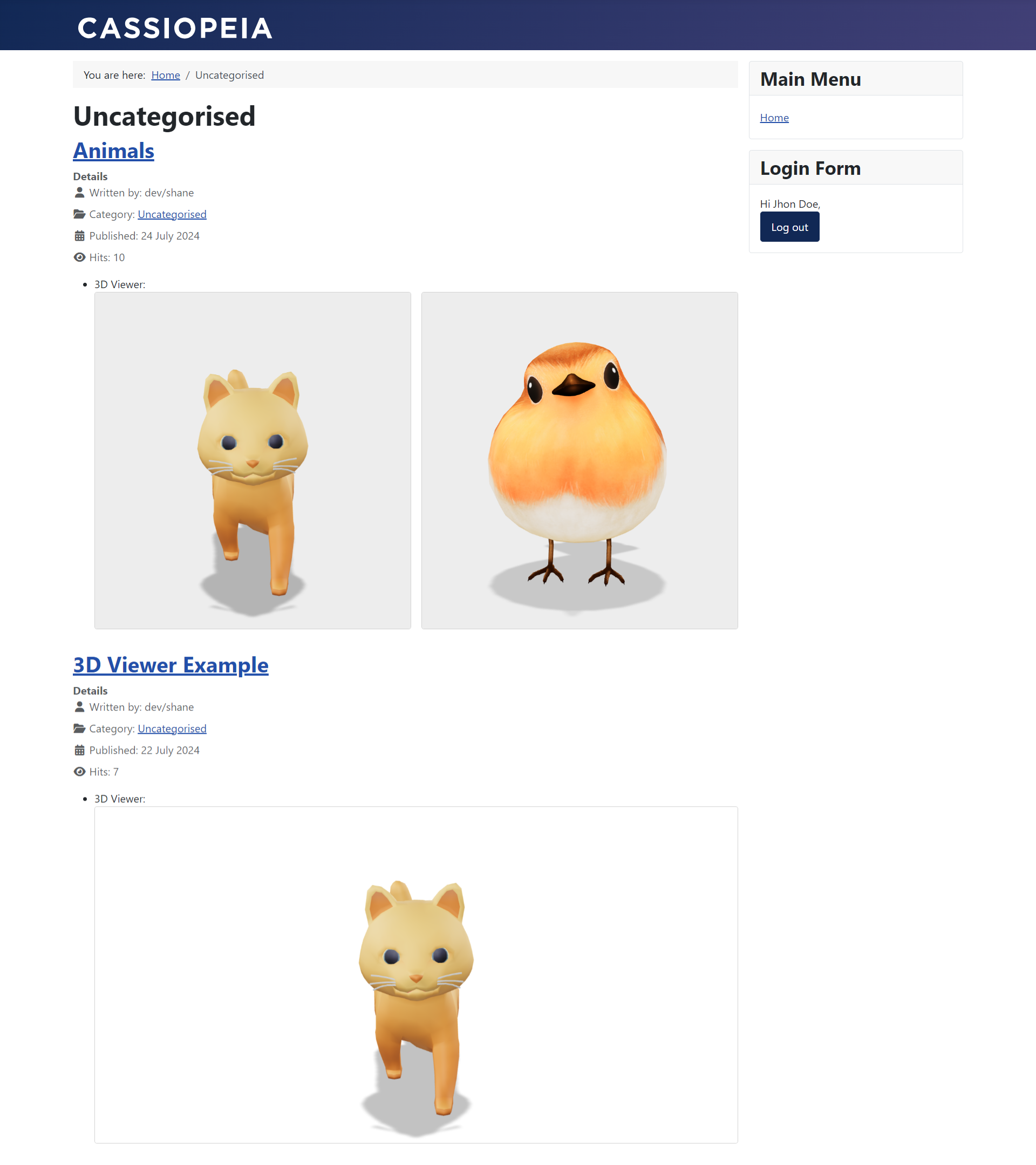
Examples
-
Container width: 80%, item height: 500px, item min-width: 250px, gap: 25px, buttons: card footer.
-
Container width: 80%, item height: 500px, item min-width: 250px, gap: 25px, buttons: overlay.
-
Fullscreen example with buttons: overlay.
-
Responsive example, container width: 80%, item height: 400px, item min width: 250px, gap: 25px, buttons: overlay.
If you have disabled downloads in the "Input Options" settings or if the user does not belong to the "Usergroups" you've defined for the 3D Viewer field, the download button will not be displayed.
Category View Display Options
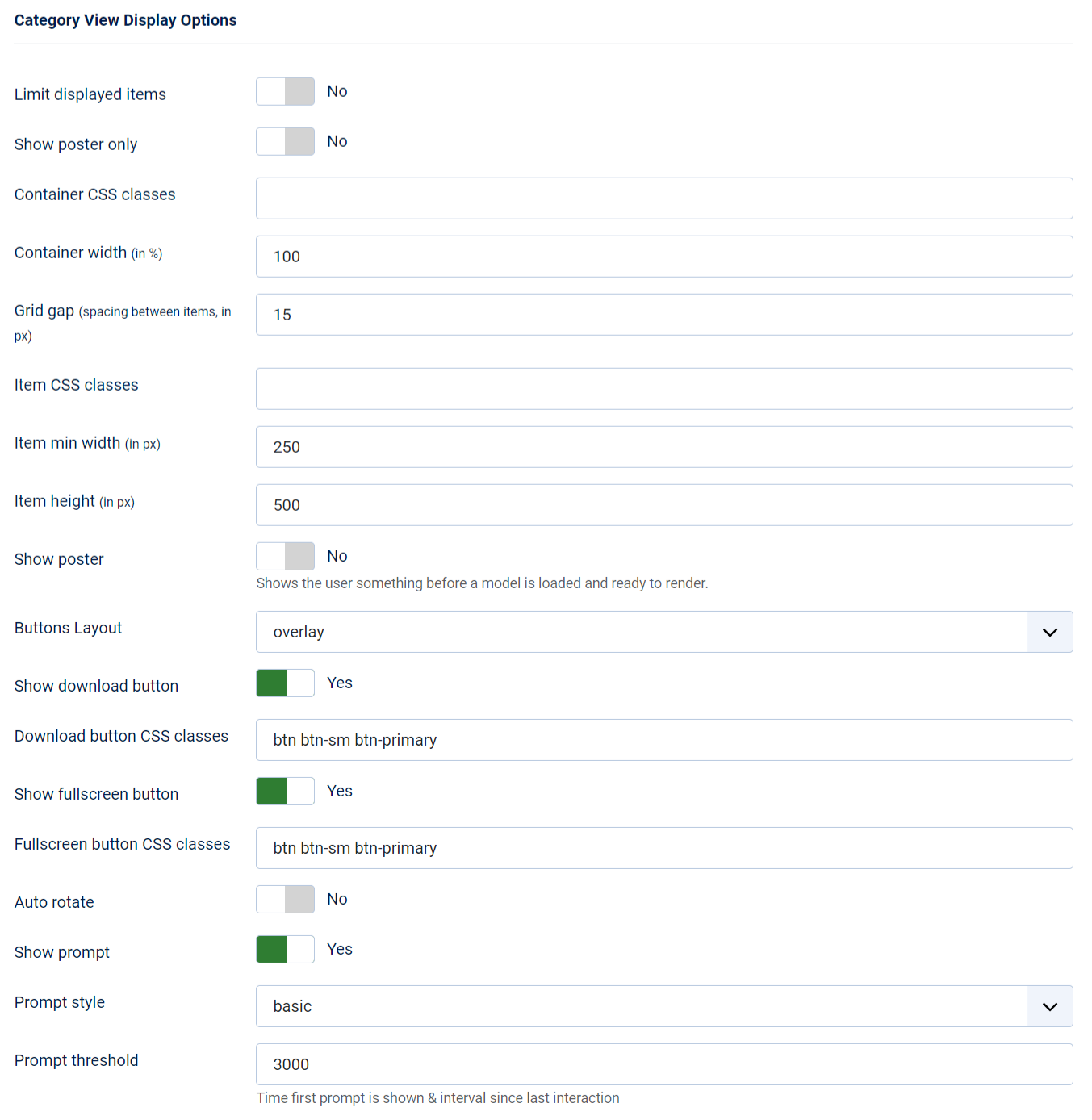
Determine how the field will be presented on your site in the Category view
- Limit Displayed Items (Yes/No): Choose whether to limit the number of items displayed in the category view. Limiting the displayed items can improve performance.
- Max Items: If "Limit Displayed Items" is set to yes, specify the maximum number of items to display.
- Show Poster Only (Yes/No): Choose whether to display only the poster image instead of rendering the full 3D model. This can improve performance by reducing the load on the system.
- Image Object Fit (CSS): Define how the poster image should be resized to fit its container. Use standard CSS values such as cover, contain, fill, etc. Only if you decide to activate "Show Poster Only".
- Container CSS Classes: Specify classes for the container element surrounding your 3D Models. You can assign
multiple classes by separating them with spaces, e.g.,
container-fluid my-container. - Container Width (in %): Define the percentage-based size of the container element that holds the 3D models for display.
- Grid gap (in px): Determine the spacing between each individual 3D model display within the container.
- Item CSS Classes: Set classes for each individual 3D model display rendered by the 3D Viewer field. You can apply
multiple classes, e.g.,
shadow-sm rounded border-0. - Item Min Width (in px): Set the minimum size in pixels for each individual 3D model display within the container, especially useful for responsive designs.
- Item Height (in px): Specify the height of each individual 3D model display within the container.
The following options are only available if you did not choose to display the poster only:
- Show Poster (Yes/No): Shows the user something before a model is loaded and ready to render.
- Buttons Layout: Choose a layout type to display your fullscreen and download buttons.
- overlay: Shows the buttons on top of the 3D model.
- card footer: Displays the buttons underneath the 3D model, giving it a card-like appearance.
- Show Download Button (Yes/No): Decide whether to display the download button or not.
- Download Button CSS Classes: Define a list of classes for the download button, e.g.,
btn btn-sm btn-light. - Download Button Text: Customize the text displayed on the download button (default is empty). Only if "Buttons Layout" is card footer.
- Show Fullscreen Button (Yes/No): Specify whether to display the fullscreen button. The fullscreen button enables users to view the 3D model in fullscreen.
- Fullscreen Button CSS Classes: Define a list of classes for the fullscreen button,
e.g.,
btn btn-sm btn-light. - Fullscreen Button Text: Set the text to display in the fullscreen button (default is empty). Only if "Buttons Layout" is card footer.
- Auto Rotate (Yes/No): Decide whether the 3D model should rotate automatically when rendered.
- Auto Rotate Start Delay: The delay before the auto rotation starts.
- Show Prompt (Yes/No): Choose whether to display the interaction prompt, which informs users that they can interact with the 3D model being shown. This setting applies to all models within the container.
- Prompt Style:
- basic: A static interaction prompt.
- wiggle: An animated interaction prompt.
- Prompt Threshold: Specify the delay before the interaction prompt is shown, relative to the user's last interaction with the 3D model.
Examples
Save Changes
After configuring the 3D Viewer field to your satisfaction, make sure to click the Apply, Save & Close, or similar button to save your changes.
