Configuring the 3D Viewer Field
Configuring the 3D Viewer field is essential to ensure that your 3D models are displayed as desired. Here's how to configure the 3D Viewer field:
Access Field Configuration
- In the Fields section, locate the 3D Viewer field you've created.
- Click on the field's name to access its configuration.
Value Options
Within the Editing tab under "Values" in the "FIELD TYPE specific configuration," you can define how the field behaves in the form view (administrator).

- Required: Specify whether the field must be filled out when saving the content type.
- Allow Multiple Values: Indicate whether multiple values are allowed for a single 3D Viewer field.
- Max #values: Set the maximum number of models you can create with a single 3D Viewer field.
- Select a Folder (Environments): Choose the folder that will house your environment images. These images can be used as a light source and/or background for your 3D models. To learn how to add your environment files, please refer to the following instructions.
- Allow Download: If you allow downloads, you will be able to upload files that can be downloaded by your site's users when viewing the 3D Model, you will need to show the download button as well to make the downloads available.
- Authorised Extensions: Define the allowed file extensions for downloadable files. The 3D model renderer used in this project only supports GLB and GLTF files. If you want to offer other file types like STL, OBJ, FBX, etc., for download, specify the allowed extensions here for the uploaded downloadable files. You can even upload ZIP files containing animations, textures, and other resources essential for your 3D model to function.
The internal 3D renderer only supports GLB and GLTF models.
- User groups: Specify which user groups are allowed to download the downloadable files.
- (EXPERT) Authorised Extensions Within a ZIP File: Define the extension types permitted within an uploadable ZIP file. This check applies when uploading 3D models in ZIP file format for use with textures and animations, as well as when uploading downloadable ZIP files. By default, Joomla doesn't allow ZIP files to be uploaded due to potential security risks. If you need to allow a LICENSE file in .txt format, for example, ensure to add the .txt extension type here. Always exercise caution and only allow extension types you trust to maintain site and user safety.
Layout Options
In the Viewing tab under Layout within the "FIELD TYPE specific configuration," you can determine how the field will be presented on your site in the Item view.

- Values layout: Select the layout for displaying 3D models in your content item. This feature is primarily geared
towards developers or individuals with technical expertise. To create custom layouts, generate a new file in
the
tmpldirectory of the plugin and name itvalue_<your-layout-name>.php. You can reference thevalue_default.phpfile to help you get started. - Container CSS classes: Specify classes for the container element surrounding your 3D Models. You can assign
multiple classes by separating them with spaces, e.g.,
container-fluid my-container. - Item CSS classes: Set classes for each individual 3D model display rendered by the 3D Viewer field. You can apply
multiple classes, e.g.,
shadow-sm rounded border-0. - Sizing:
- Container width (in %): Define the percentage-based size of the container element that holds the 3D models for display.
- Item min width (in px): Set the minimum size in pixels for each individual 3D model display within the container, especially useful for responsive designs.
- Item height (in px): Specify the height of each individual 3D model display within the container.
- Grid gap (in px): Determine the spacing between each individual 3D model display within the container.
- Buttons Display:
- Layout: Choose a layout type to display your fullscreen and download buttons.
- overlay: Shows the buttons on top of the 3D model.
- card footer: Displays the buttons underneath the 3D model, giving it a card-like appearance.
- Download Button - Show: Decide whether to display the download button or not.
- Download Button - CSS classes: Define a list of classes for the download button, e.g.,
btn btn-sm btn-light. - Download Button - Text: Customize the text displayed on the download button (default is empty).
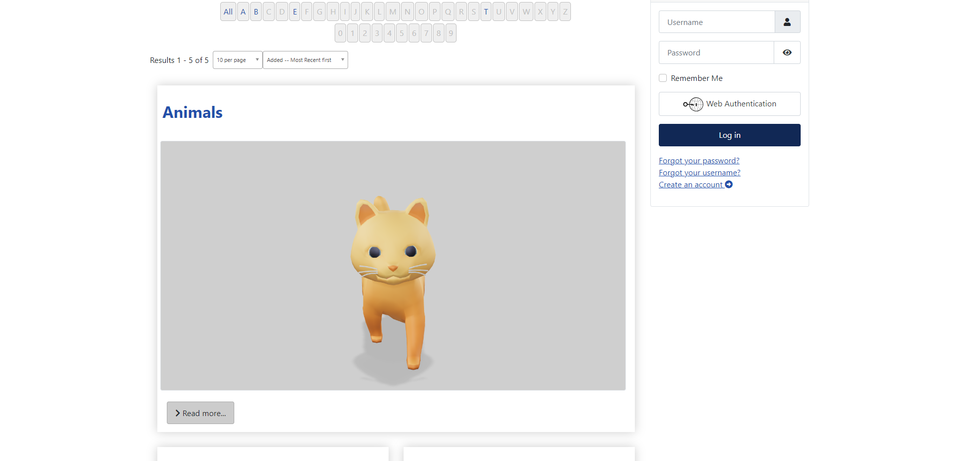
- Fullscreen Button - Show: Specify whether to display the fullscreen button. The fullscreen button enables users to view the 3D model in fullscreen.
- Fullscreen Button - CSS classes: Define a list of classes for the fullscreen button,
e.g.,
btn btn-sm btn-light. - Fullscreen Button - Text: Set the text to display in the fullscreen button (default is empty).
- Layout: Choose a layout type to display your fullscreen and download buttons.
- Staging:
- Auto Rotate: Decide whether the 3D model should rotate automatically when rendered.
- Auto Rotate Start Delay: The delay before the auto rotation starts.
- Interaction Prompt - Show prompt: Choose whether to display the interaction prompt, which informs users that they can interact with the 3D model being shown. This setting applies to all models within the container.
- Interaction Prompt - Style:
- basic: A static interaction prompt.
- wiggle: An animated interaction prompt.
- Interaction Prompt - Prompt Treshold: Specify the delay before the interaction prompt is shown, relative to the user's last interaction with the 3D model.
Examples
-
Container width: 80%, item height: 500px, item min-width: 250px, gap: 25px, buttons: card footer.
-
Container width: 80%, item height: 500px, item min-width: 250px, gap: 25px, buttons: overlay.
-
Fullscreen example with buttons: overlay.
-
Responsive example, container width: 80%, item height: 400px, item min width: 250px, gap: 25px, buttons: overlay.


If you have disabled downloads in the "Values" settings in the "Editing" tab or if the user does not belong to the " Usergroups" you've defined for the 3D Viewer field, the download button will not be displayed.
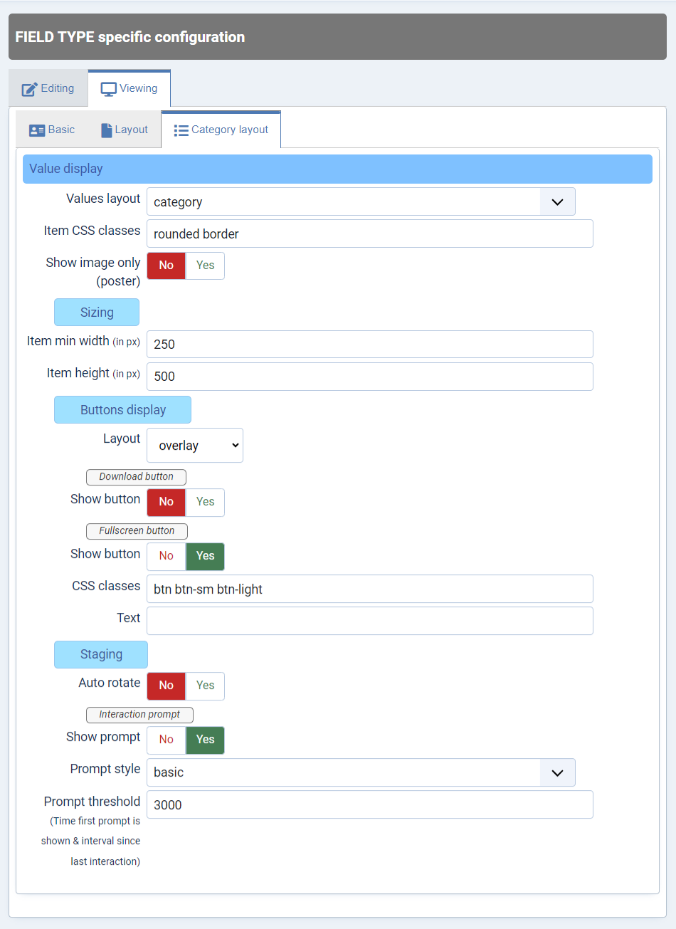
Category Layout Options
In the Viewing tab under Category Layout within the "FIELD TYPE specific configuration," you can determine how the field will be presented on your site in the Category view
The default category layout displays only the first model from the 3D Viewer field. This deliberate choice helps prevent the need to load too many 3D models within the category view, which could negatively impact your site's loading performance.
- Values layout: Select the layout for displaying 3D models in the category view. This feature is primarily geared
towards developers or individuals with technical expertise. To create custom layouts, generate a new file in
the
tmpldirectory of the plugin and name itvalue_<your-layout-name>.php. You can reference thevalue_category.phpfile to help you get started. - Item CSS classes: Set classes for the 3D model display rendered in the category view. You can apply multiple
classes, e.g.,
rounded border. - (Recommended) Show Image Only: To enhance performance, you have the option to display only the image/poster when viewing the category. You can generate this poster in the Model editor. For more details, please refer to: The Editor.
- Sizing:
- Item min width (in px): Set the minimum size in pixels for the 3D model display, especially useful for responsive designs.
- Item height (in px): Specify the height of the 3D model display.
- Buttons Display:
- Layout: Choose a layout type to display your fullscreen and download buttons.
- overlay: Shows the buttons on top of the 3D model.
- card footer: Displays the buttons underneath the 3D model, giving it a card-like appearance.
- Download Button - Show: Decide whether to display the download button or not.
- Download Button - CSS classes: Define a list of classes for the download button, e.g.,
btn btn-sm btn-light. - Download Button - Text: Customize the text displayed on the download button (default is empty).
- Fullscreen Button - Show: Specify whether to display the fullscreen button. The fullscreen button enables users to view the 3D model in fullscreen.
- Fullscreen Button - CSS classes: Define a list of classes for the fullscreen button,
e.g.,
btn btn-sm btn-light. - Fullscreen Button - Text: Set the text to display in the fullscreen button (default is empty).
- Layout: Choose a layout type to display your fullscreen and download buttons.
- Staging:
- Auto rotate: Decide whether the 3D model should rotate automatically when rendered.
- Auto Rotate Start Delay (in ms): The delay before the auto rotation starts.
- Interaction Prompt - Show prompt: Choose whether to display the interaction prompt, which informs users that they can interact with the 3D model being shown. This setting applies to all models within the container.
- Interaction Prompt - Style:
- basic: A static interaction prompt.
- wiggle: An animated interaction prompt.
- Interaction Prompt - Prompt Treshold (in ms): Specify the delay before the interaction prompt is shown, relative to the user's last interaction with the 3D model.
Examples
-
Category view, image only. Item height: 500px, Item min width: 250px.
-
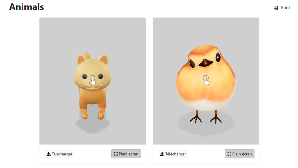
Category view, with model display. Item height: 500px, Item min width: 250px, fullscreen button only, buttons display: card footer.
-
Category view, with model display. Item height: 500px, Item min width: 250px, all buttons, buttons display: overlay.

Save Changes
After configuring the 3D Viewer field to your satisfaction, make sure to click the Apply, Save & Close, or similar button to save your changes.